What is a Payphone?

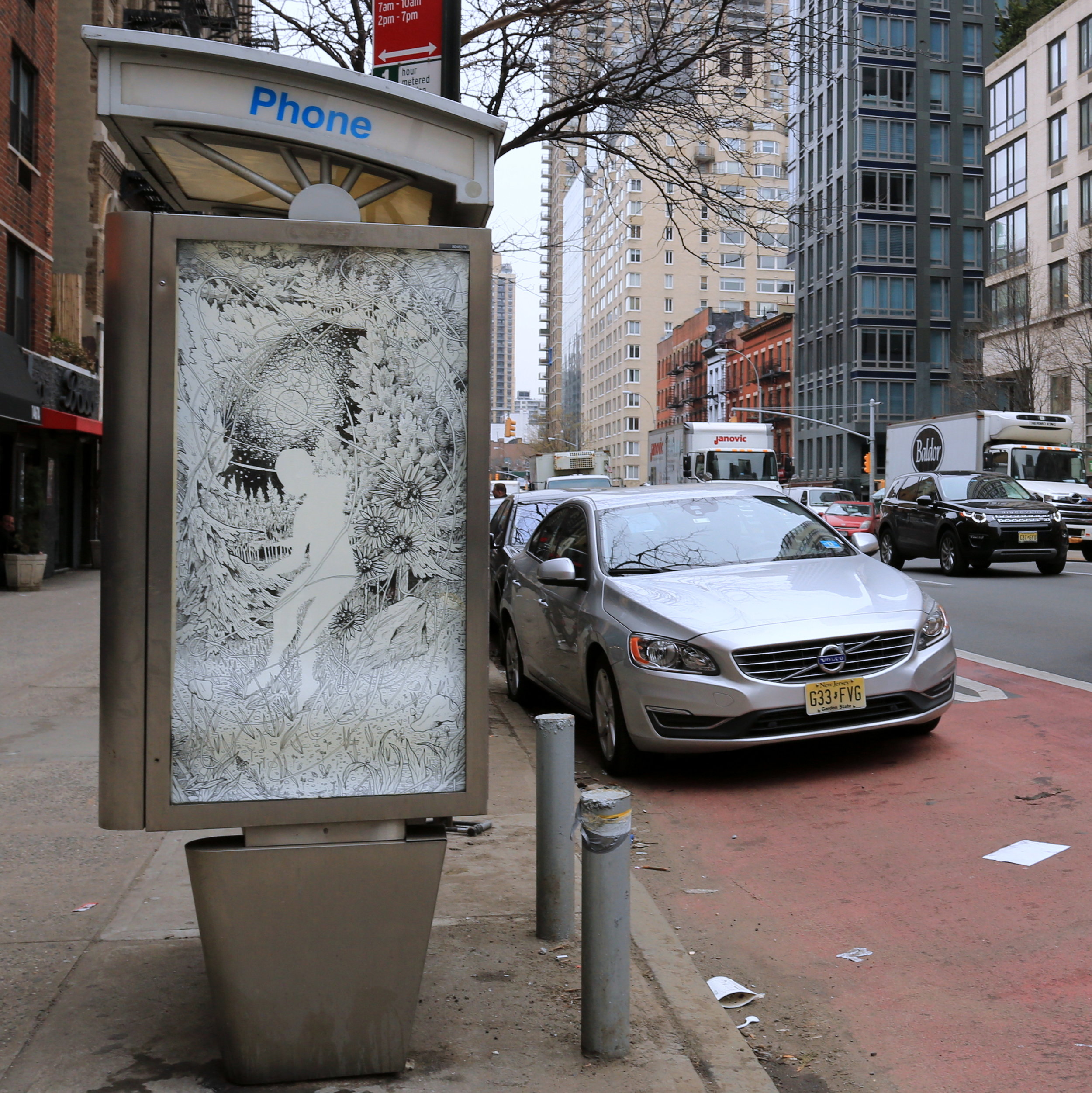
I HATE THE SOUND OF SILENCE by Cheryl Pope. Photo by Luna Park.

I HATE THE SOUND OF SILENCE by Cheryl Pope. Photo by Luna Park.

This week's installation is on a payphone with three active advertisements, but zero functioning phones, so it's only fitting that it's where we installed Cheryl Pope's I HATE THE SOUND OF SILENCE. Here's what she had to say about the piece:

"I HATE THE SOUND OF SILENCE is the voice of a Chicago Youth responding to issues of inequality, police brutality, political corruption and resulting violence in the United States. Elevating this statement to a Championship Statement increases the volume, weight, and physicality of this lived experience and feeling of anger, pain and frustration.

"I selected this statement for ART IN AD PLACES and specifically on the telephone booth for its relationship to connection, conversation, and public accessibility. When I was young I saw the public phone as a resource if needed to call for help, a direct line to 911 or the operator. The deactivation of these public, democratic resources is a metaphor of the silence, the survival of the individual rather than a sense of a communal support system.

"It also pushes against the phone as an object that keeps us distracted, our inability to be silent, to confront, to be alone with ourselves. Our fear of what might be seen, heard, or felt within the silence."

The site of Cheryl's piece, because none of the phones there actually work, is a great example of what payphones in NYC have become: no longer a public service, they are only venues for advertising. Why should we, as people who have to walk by these booths every day, put up with that encroachment in public space with no benefit? Well, at Art in Ad Places, we would say that we shouldn't put up with it.

As an aside, it's great to have our first artist from Chicago, co-curator RJ Rushmore's hometown.

I HATE THE SOUND OF SILENCE by Cheryl Pope. Photo by Luna Park.
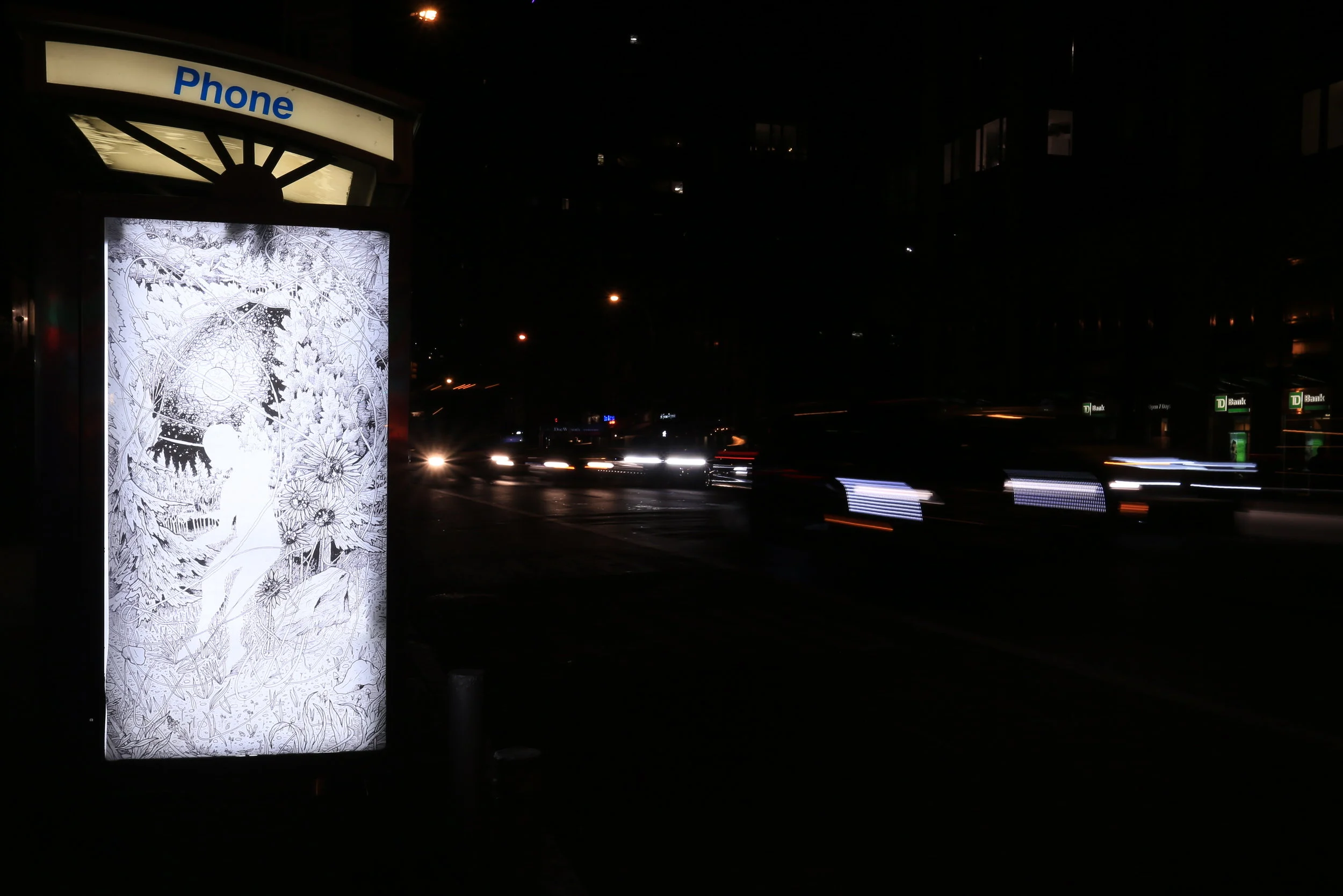
I HATE THE SOUND OF SILENCE by Cheryl Pope. Photo by Luna Park.

Everything We Do is Political

Absence by Noel'le Longhaul. Photo by Luna Park.

Absence by Noel'le Longhaul. Photo by Luna Park.

Noel'le Longhaul's contribution to Art in Ad Places exemplifies what we're looking for with this project, and we hope you enjoy it as much as we do. If you just walk by her poster and enjoy it more than an ad, great; if you see it and understand the meaning behind it, fantastic; and if you walk by and appreciate not just the meaning of the work but also the reason it's place where it is, that's pure gold.

Here's what Noel'le has to say about Absence:

Absence engages the labyrinthine topic of belonging to the North American landscape as a descendent of white colonists. To have a non-violent relationship with stolen land that has been exploited for centuries to further the projects of patriarchy and white supremacy is impossible: Absence subtly asserts that whiteness sacrificed its right to a genuine spiritual knowledge of the interdependence of the land and our bodies when the first witch was burned. The rise of capitalism and the institutionalization of racism, misogyny, abilism, xenophobia, and transphobia/transmisoginy hinges on this moment of spiritual and cultural suicide. Absence is both an image of celebration and of mourning. It is celebratory in that it gestures towards a reverence for the intricacy and majesty of the altered New England landscape, and embodies a spirit of feminine care for its detail and complexity. It is an act of mourning in that it acknowledges that although I have the blood of witches in me, I also have at my core a history that has destroyed them. The white figure as negative space is not an accident: it names my body as void. The way that the globalized power of whiteness has and continues to assert itself evidences an insatiability: the fetishization and appropriation of the art, fashion, spirituality, and music of people of color evidence that there no longer is a white culture or whole spirit. It defines itself through consumption, appropriation, and aggregation, consuming the resources of our planet as readily and constantly as it consumes non-white cultures. Absence is an attempt to turn that violence into a contemporary resistant spirituality, equal parts critique and spellcraft. Identifying with the history of loss of the marginal spiritual knowledge of women and queers is the closest I can come to a genuine spiritual relationship with the New England landscape I call "home."

I wanted to participate in Art in Ad Places because I'm making highly political work that isn't really coded as such. Being in a politicized art campaign alongside a bunch of other amazing dissident artists struck me as an opportunity to have that aspect of my work become more legible. An interruptive art campaign like this feels like a way to push back against a few things: for one, it pushes back against the daily intake of imagery that is in service, ultimately, to violence: most of the media we take in is a conduit for oppressive social norms. It also feels like a way to assert that it is possible to make political art in a way that is not explicitly partisan or didactic, but is nonetheless confrontational when it is engaged with within certain contexts; like this one. I endeavor to make artwork infused with a spirituality that is not appropriative or escapist, which for me means starting with confronting the nature of my circumstances as a white transfeminine non-urban person. Bringing that work into an urban context feels like a rare opportunity to be re-contextualized by contemporary political struggle.

"Absence" by Noel'le Longhaul. Photo by Luna Park. 

"Absence" by Noel'le Longhaul. Photo by Luna Park.


"Absence" by Noel'le Longhaul. Photo by Luna Park.

"Absence" by Noel'le Longhaul. Photo by Luna Park.

A Vision of Today, with Hope For Tomorrow

No Future by Shepard Fairey. Photo by Luna Park.

No Future by Shepard Fairey. Photo by Luna Park.

There is perhaps no better artist than Shepard Fairey to simultaneously address this dark moment in American politics and the nature of advertising. This week, we installed Shepard's No Future in the heart of New York City. It serves as a reminder to stay strong, loving, and loud, and that there are brighter days on the horizon.

This poster is an update on one of Shepard's recent prints, about which he wrote:

My art is usually social and political regardless of who is in the White House, but my concerns and frustrations are amplified by the election of Donald Trump. I joked while Trump was campaigning that his slogan should be “Manifest Density,” a parody of “Manifest Destiny,” which was an embarrassingly egotistical pronouncement by rich white men that it was God’s desire for them to conquer ocean to ocean in the territory that would become the United States. Trump appealed to an uninformed electorate who looked for scapegoats and were driven by most likely one or more of the dark impulses listed in the print. I’m pushing for a future where those impulses have no place and definitely no traction. Let’s move forward, not backward.

Reflecting on this installation specifically, Shepard adds:

Art in public space, especially in place of an ad, disrupts the trance of conspicuous consumption that is perpetuated by the constant bombardment of advertising communication that suggests our value and values are determined by the things we purchase. Creative expression as an alternative to advertising or even a critique of advertising gives us a wider and invigorated perspective, as well as an understanding that communication can go two ways.

No Future by Shepard Fairey. Photo by Luna Park.

No Future by Shepard Fairey. Photo by Luna Park.

So let's move forward with boldness and love, towards a future with many perspectives, and none of them hate.

Feeling Overwhelmed? You're Not Alone.

Artwork by Jim Houser. Photo by Luna Park.

Artwork by Jim Houser. Photo by Luna Park.

It's been fascinating see how the meaning of certain Art in Ad Places posters has changed. When we first received this piece from Jim Houser, it felt very personal, an image to meditate on privately, even if you found it in a public place. As for now... let's let Jim weigh in on that:

When RJ asked me to contribute, I felt like it was an interesting opportunity to share some work outdoors. I don’t often make things specifically designed to be shared on the street. I thought it would be good to use something that was simple and subdued, not as text heavy and bright as much of my work usually is. The idea behind the piece was originally meant for a skateboard graphic, but I felt it would be better served in this context. It’s meant to evoke the feeling of being overwhelmed, which is fitting in the climate we now find ourselves living our lives.

On another note, look closely in the photo above. You can catch a glimpse of Luna Park, the photographer who has been documenting every Art in Ad Places installation. Sometimes, these posters last weeks. Other times, just days. And they're all over New York City. That makes documentation almost as important as the physical installation. If you happen to come across an Art in Ad Places installation in person, we hope snap a photo and post it on Instagram or send it to us. We love seeing how each poster is holding up and how people are responding to them. With your permission, we might even reshare your pic.

Artwork by Jim Houser. Photo by RJ Rushmore.

Artwork by Jim Houser. Photo by RJ Rushmore.

"If my parents are deported..."

Erick by Michelle Angela Ortiz. Photo by Luna Park.

Erick by Michelle Angela Ortiz. Photo by Luna Park.

"If my parents are deported, I will have to raise my sister." - Erick, 13 years old

One of the beautiful things about public art is that it can give voice to the people we most need to hear from. We don't need to be sold the latest Hollywood movie. Right now, we need to hear from people like Erick about the real-life realities of US immigration policy.

We're honored to have Michelle Angela Ortiz participating in Art in Ad Places this week, and couldn't have asked for a more timely and poignant contribution. Michelle is one of Philadelphia's best muralists, and her practice focuses on the immigrant experience. If you're not already, be sure to follow her on Instagram.

"My portrait of Erick represents the many families affected by the threat of deportations," Michelle explained to us, "In this current anti-immigrant climate, it is necessary to represent the images and messages of immigrant communities fighting for a better life in this country."

Erick by Michelle Angela Ortiz. Photo by Luna Park.

Erick by Michelle Angela Ortiz. Photo by Luna Park.