Advertising, Representation, and Perception

HOODED by Myles Loftin. Photo by Luna Park.

HOODED by Myles Loftin. Photo by Luna Park.

Myles Loftin, a 19 year old photographer, is making the kind of work that we need to see. This direct and heartfelt challenge to media representation is what we were dreaming of when we were in our early days of creating this project. We came across his work online earlier this year.

Antwaun Sargent, writing in Creators Project, explained Loftin the inspiration behind HOODED series saying, "Myles Loftin, was scrolling through his Twitter feed and came across a tweet that displayed the results of a Google search of the words, 'four black teens' and 'four white teens.' The search results for white teens turned up stock photos of white teenagers smiling, attending high school, and posing together. The results for their black counterparts surfaced mostly mugshots, a 'WANTED' sign, and photos of black teens in police custody. 'It wasn't entirely shocking to me,' explains Loftin to Creators, 'I already have an understanding of the way black people are viewed in the world.' Seeing the search results 'really hurt' him, he says, because he couldn't understand why those images are being used to represent him and his peers. 'I wanted to know why I couldn't find many images of positive portrayals of black teens.'"

To BET, Loftin said, "I just wanted people to be able to see Black boys in a different light. We can be playful, we can be soft, we can be feminine, we can be whatever we want. We don’t have to be put into a box by what the media says about us or how they show us to people."

We read those articles and immediately felt that Loftin was on to some of the same ideas that get us fired up when we think about the outdoor advertising industry. The images we see every day, whether they be in Google searches or on billboards, shape our perceptions and our actions. Putting more positive and varied images into the world will give people more positive and varied perceptions of the people and things depicted. Luckily, it seems Loftin agrees. He told us, "I'm participating in Art in Ad Places because I think that it's a really cool idea to replace the overwhelming nature of advertisement that we encounter everyday with great art. The work that I've decided to contribute to this project is about reshaping the representations of black males."

In some ways, what makes the work even more powerful in our particular context is that Loftin's aesthetic so closely mimics advertising. This poster is possibly the closest we have come so far in Art in Ad Places to détournement. And while that's not what we're going for every week, it sure feels nice to use the advertising industry's aesthetics to critique it.

HOODED by Myles Loftin. Photo by Luna Park.
HOODED by Myles Loftin. Photo by Luna Park.

Proposal for A Flag

No Te Olvides by Jonathan Gardenhire. Photo by Luna Park.

No Te Olvides by Jonathan Gardenhire. Photo by Luna Park.

New Yorkers could not ask for better weather this weekend for the city's Puerto Rican Day Parade (and all of the satellite festivals and parties). If you're celebrating, you'll also want to keep an eye out for a poster from Jonathan Gardenhire. Here's what Jonathan has to say about No Te Olvides ("don't forget"):

For Art in Ad Places, I’ve reimagined the first Puerto Rican flag, “The Revolutionary Flag of Lares,” with black, red, and green, the colors of the Black Liberation flag. At a time when Puerto Rico is struggling due to economic neglect from the United States, on the weekend of New York City’s Puerto Rican Day parade, I consider remembrance and imagination as a piece of the solution for the people.

No Te Olvides by Jonathan Gardenhire. Photo by Luna Park.

No Te Olvides by Jonathan Gardenhire. Photo by Luna Park.

For the Sake of Beauty and Strangeness

Caterpillar by Mab Graves. Photo by Luna Park.

Caterpillar by Mab Graves. Photo by Luna Park.

In this video with Rick Lowe and Nato Thompson, they try to tease out a real gem of a problem facing social practice art: Nato, quoting Tania Bruguera, says, "I want it to be the thing, not point at the thing. I want an artwork that is the thing, doesn't point at the thing." That idea, and Lowe's explanation of how it applies to his Project Row Houses, sum up a critical concern for all of us involved in Art in Ad Places: How do we take AiAP (or anti-advertising resistance in general) from a gesture to a sustainable solution to the out-of-home advertising industry, or to what extent is it useful for our work to remain a poetic gesture?

One possible answer is in the artists that we work with, and the structure that we provide for them. This week, we have a poster from Mab Graves. She told us, "I decided to participate in Art in Ad Places and contribute this piece because we are constantly being bombarded and saturated in images designed to manipulate for one thing or another. I loved Art in Ad Places' concept of just bringing a brief blink of beauty - purely for the sake of beauty and strangeness - into the grey streets cluttered pictorial noise."

A number of the artists we've worked with have made a similar point about the beauty in the gesture of installing one poster. And without that gesture, where would we be? The gestures are the essential element, the interruptions in our regularly scheduled programming, and Art in Ad Places is a structure to provide them. It is, also, hopefully a step towards a structure that replaces the regularly scheduled programming.

The thing to do seem to be to keep up these gestures, be mindful to simultaneously build a structure, and push towards a structure that is made up of gestures, but also replaces the existing paradigm. Because, as Lowe points out, art projects need to retain that poetic gesture, lest they get sucked into the social practice equivalent of selling out (e.i. move into the realm of creative placemaking). Maybe Art in Ad Places can be the thing that invites things in to point to the thing. If that makes any sense...

For now, this week's beautiful gesture:

Caterpillar by Mab Graves. Photo by Luna Park.

Caterpillar by Mab Graves. Photo by Luna Park.

Can You Believe Your Eyes?

LSD & THE DEVIL by Nicomi Nix Turner. Photo by Luna Park.

LSD & THE DEVIL by Nicomi Nix Turner. Photo by Luna Park.

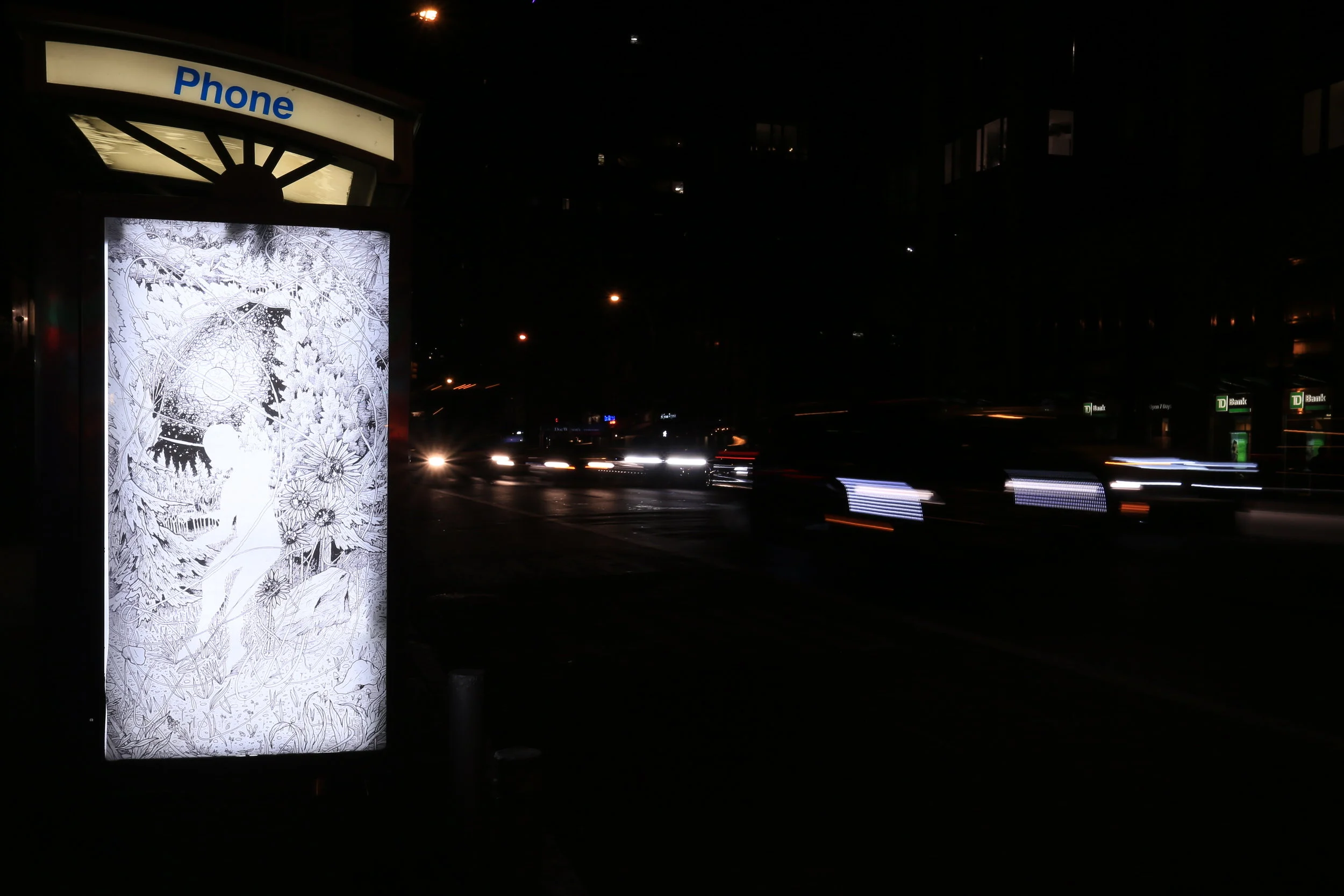
Every week, we face this funny negotiation looking for a location to install at: Is there glare on the glass? What sort of things are going to show up behind the booth in a photo? Where's convenient for us to get to on the way home from work? Where can we find that's relevant to the artist or their work? Occasionally, things come together perfectly, which seems to be the case this week with Nicomi Nix Turner's LSD & THE DEVIL. For a lot of posters, those shadows on the phone booth could be a problem. With Nicomi's piece, we saw those and actually got quite excited. They lined up perfectly with the figure in her drawing, almost like rays of light coming down, rather than the shadow of a telephone pole. Which is all to say, sometimes we get lucky, but also that those shadows, which have fallen on every ad in that booth for years, finally served a kind of purposed and added to the beauty of the landscape.

Here are Nicomi's thoughts on the work:

LSD & THE DEVIL was a piece I had been wanting to work on for a while now. It’s nothing complex - a simple portrait. But behind the simplicity is something I have been grappling with for some time now: the moment when you don't know if you can believe your eyes or what your brain is telling you you're seeing or hearing. Initially diving into the works, I lead with the idea of hallucinations, divinity and the belief in heaven and hell after death, however, when RJ asked me to participate in this project, I felt the piece was fitting. In the age of digital manipulation, the internet and misinformation, it often feels like we often grapple with this parallel “reality" – the real life and the fabricated life. I’m participating in the project because so often we are coerced into accepting someone else’s concept of reality, and/or ideals and we all need a break from that when we can get it.

Nicomi makes a great point about the dangers of trusting and accepting reality as it is fed to us, and as that relates to advertising, it's of course reminiscent of this classic scene from They Live. By simply consuming advertising in the background of our lives every day, we fall victim to its often-subtle coercion. Quick: Name 5 insurance companies, or 3 beach vacation destinations. How did those answers come to mind? At least to some degree, it's because we've been seeing ads for Geico and Cancun all of our lives. Are they the best? Maybe, or maybe not. But we've accepted them as possible answers because they've been fed to us, even if we believe that "advertising doesn't work on me."

So, please enjoy this break:

LSD & THE DEVIL by Nicomi Nix Turner. Photo by Luna Park.

LSD & THE DEVIL by Nicomi Nix Turner. Photo by Luna Park.

An Opportunity to Engage

Artwork by Mel Kadel. Photo by Luna Park.

Artwork by Mel Kadel. Photo by Luna Park.

This week we have a poster from Mel Kadel. Here are her thoughts on Art in Ad Places and her poster:


What a great opportunity this is, to place a piece of art in a spot that is strictly reserved for advertising.

The original image would normally have been hung in a gallery, with a very limited audience who seek out art exhibitions.

For that audience I am thankful, but this project breaks that wall down and brings art to our streets which are oversaturated with ads.  

My thoughts behind this image have to do with our strides to unify and keep a hopeful vision during a really dark and complex time.

That feeling of unity might have been on my mind when making it, but like anything visual, everyone sees things differently.

So whether it raises curiosity, makes someone smile, inspires contemplation, or is just noticed for a moment, I hope it draws people in for a change of scenery.

- Mel Kadel

Mel's point about opportunity is a particularly interesting one. Why are we not given these opportunities to take some ownership over public spaces? Why are certain public spaces "strictly reserved" for something other than public use? And what would it mean to change that? Artist/activist Jordan Seiler and actors Cody Lindquist and Charlie Todd touch on that point in a recent episode of Lindquist and Todd's podcast Two Beers In, as they reflect on a project by Sophie Calle and Paul Auster.

Here's an experiment, not unlike Auster's challenge to Calle (but which we are stealing from Evan Roth, who used to assign his students to do this): Carry a permanent marker in your pocket for a week. Something strong from the graffiti tools section of your local art supply store. You don't even have to use the marker, but just know that you could use it. See how it makes you feel about the spaces you walk through, feel the newfound power, and consider whether or not to use it. With that marker, spaces that may feel strictly reserved for others may suddenly feel open to you. And now imagine that everyone carried a marker, ready to engage with public space, and what a wonderful world that would be.

Artwork by Mel Kadel. Photo by Luna Park.

Artwork by Mel Kadel. Photo by Luna Park.