Millennials Who Brunch

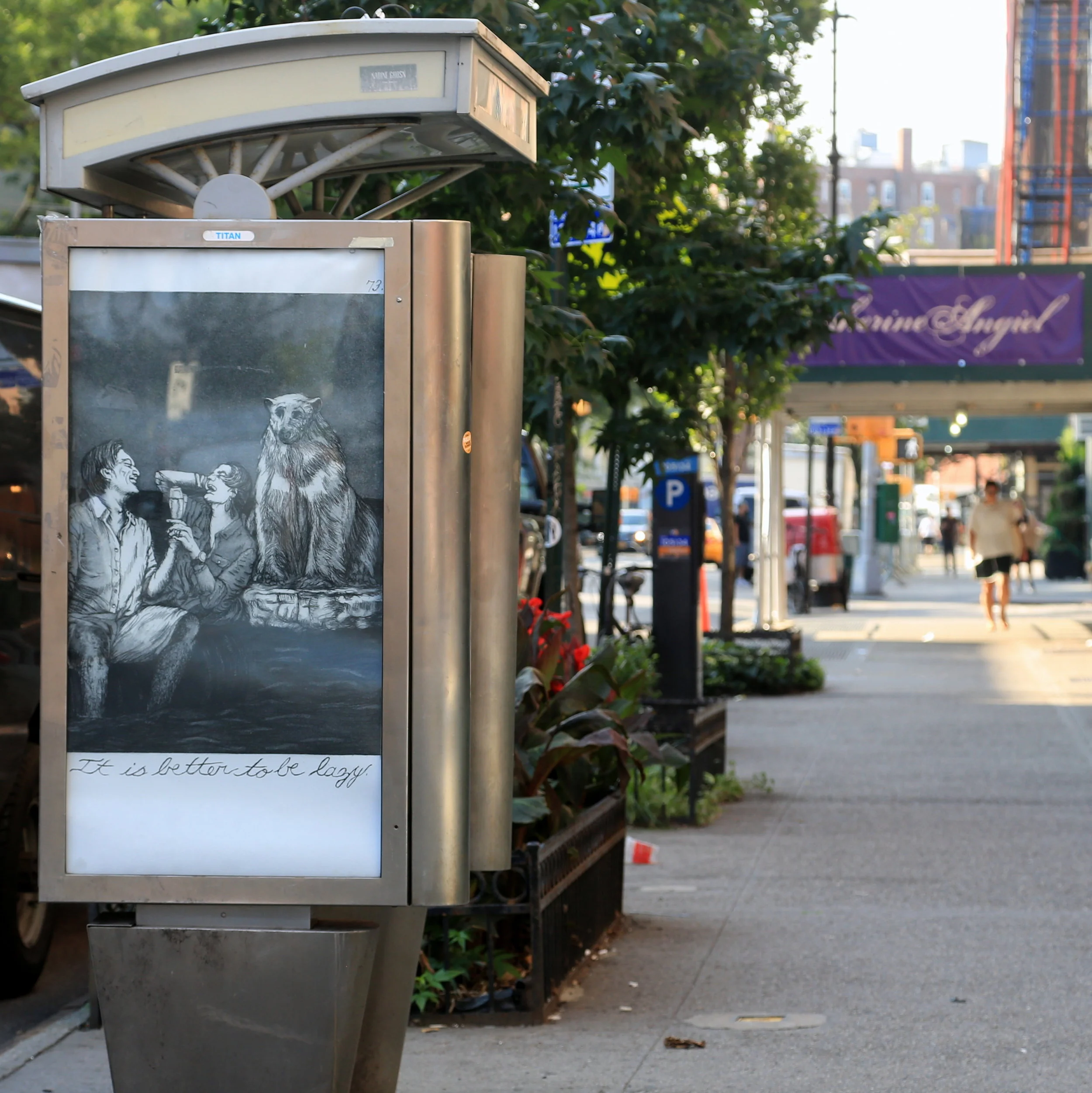
Plate 73: It is better to be lazy. by Emily Lombardo. Photo by Luna Park.

Plate 73: It is better to be lazy. by Emily Lombardo. Photo by Luna Park.

When Emily Lombardo showed us her piece for Art in Ad Places, it was immediately obvious where it had to be installed: Somewhere with lots of people waiting for brunch. What is more IDGAF luxury than waiting a hour to get into a brunch spot for bottomless mimosas? We haven't been installing a lot of work that is explicitly anti-consumerist, but that is certainly a component of Art in Ad Places. In short, as advertising encourages consumption (especially conspicuous consumption), it encourages selfishness and anti-environment behaviors. Easier to drink a glass of champagne that bother about the world about to end. That's the thought-process that advertising reinforces.

Here's what Emily has to say:

I contributed Plate 73: It is better to be lazy. from The Caprichos, 80 etchings after Goya’s Los Caprichos, to be included in Art in Ad Places as a continuation of the tradition of social critique through art started by Goya in 1799. Los Caprichos, often considered the first work of modern art, was a major departure from Goya’s work as a court painter in Spain. With the aim of making this work accessible to the Spanish people he released the work for sale in a perfume shop. The work cleverly exposes the glut, excess and oppression the upper/religious class imposed on the people. Unfortunately these themes reach across history into our present day, which inspired me to recreate this work through a queer feminist lens.

I was compelled to work with Art in Ad Places because these ad spaces are used to distract us from the real issues of our time. Just as the couple floats on an oil barrel toasting with champagne, they are blind to the issues of global warming and rising sea levels. Corporate ads try to transport us into this fantasyland of luxury. This work and the actions of Art in Ad Places argues: Luxury=Death…is it better to be lazy?

So... Cheers! To the millennials who brunch!

Plate 73: It is better to be lazy. by Emily Lombardo. Photo by Luna Park.
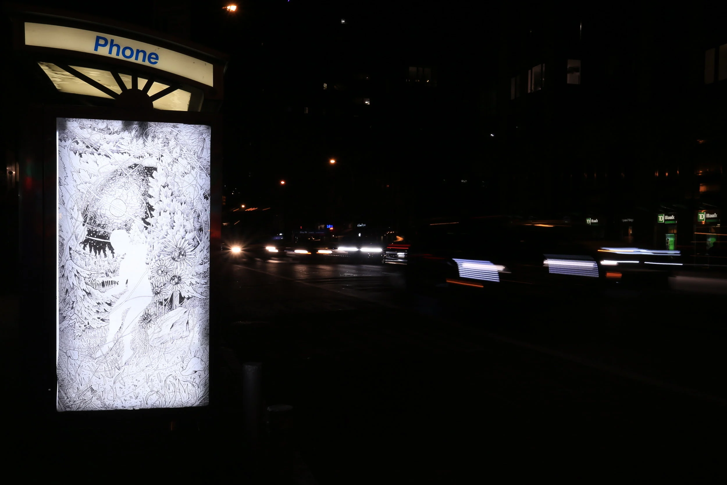
Plate 73: It is better to be lazy. by Emily Lombardo. Photo by Luna Park.

Abstracting The City

Artwork by Sam Horine. Photo by Luna Park.

Artwork by Sam Horine. Photo by Luna Park.

Sam Horine has an eye for cities. He's one of New York's most well-regarded street and urban landscape photographers. So it's a real treat to see him embracing Art in Ad Places this week, and with a piece that's a bit different from the crisp cityscapes he's known for.

"I'm participating in the Art in Ad Places project because I love the subtlety of it - in so many ways we are bombarded by calls to action and attention by ads every single day and so for this project I chose an image that visually meant nothing - an out of focus image of Manhattan's fabled meatpacking neighborhood - a neighborhood itself so transformed as to be nearly unrecognizable from how I remember it. The image itself is meant to be an abstraction, a color palette, something that you could easily pass by and never notice or something that could stop you and pull you in as you attempt to make sense of the scene." - Sam Horine

We haven't installed much abstract work this year, but it's a powerful thought, that Sam's piece is simultaneously a beautiful photo and something abstract that doesn't demand your attention and allows you to ignore it.

One question we often get is, "Why don't you install a dozen or more copies of each week, instead of just one?" Well, besides printing cost and the time commitment, Sam's poster is an interesting example of something that might work better as a single-installation. Imagine seeing this image in every payphone in a neighborhood. Yes, it would be great to get rid of all of those ads, but after a certain amount of repeat viewing, the image itself would transition from an abstract color palette into an icon of sorts, almost like a logo or an ad itself. And of course there's something romantic about knowing that this modest gift only exists on one little corner this busy city.

Artwork by Sam Horine. Photo by Luna Park.

Artwork by Sam Horine. Photo by Luna Park.

Amy Sol's Daydream

Circadia by Amy Sol. Photo by Luna Park.

Circadia by Amy Sol. Photo by Luna Park.

"While painting this piece, I imagined being emerged in a place of solitude and peace. It is the kind of space that most often can only be created within ourselves; when the outside world does not provide it. I choose this piece for Art in Ad places because it is quiet and gentle, it is unobtrusively there for those who want to observe it. I hoped this would translate in a busy metropolis as a sort of respite from the noise, and maybe even a gateway for daydreaming." - Amy Sol

Every time we explain Art in Ad Places to someone who works in marketing or advertising, one suggestion inevitably comes up: Pitch this project to brands, with some big corporation paying artists to put up their work all over the city instead just printing up 1-2 posters and having to go the guerrilla route. But that (largely) misses the point. All too often, brands + street art wind up like this. Maybe it's a lack of dreaming that stifles those advertising exec's imaginations. They have an inability to envision a world without outdoor advertising. This week, Amy Sol is here to help.

PS, this piece is backlit, so if you can find it, dusk or night are the best times to stop by.

Circadia by Amy Sol. Photo by Luna Park.

Circadia by Amy Sol. Photo by Luna Park.

Once Again We're Wiggling in the Weird

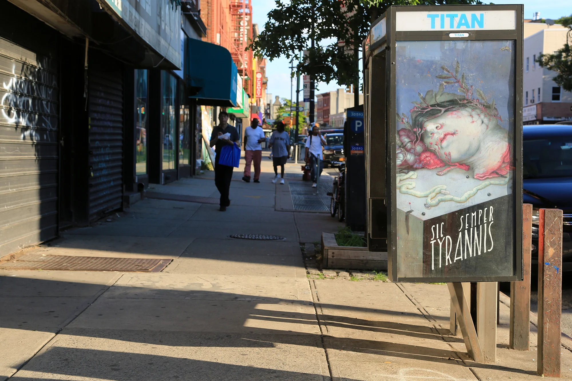
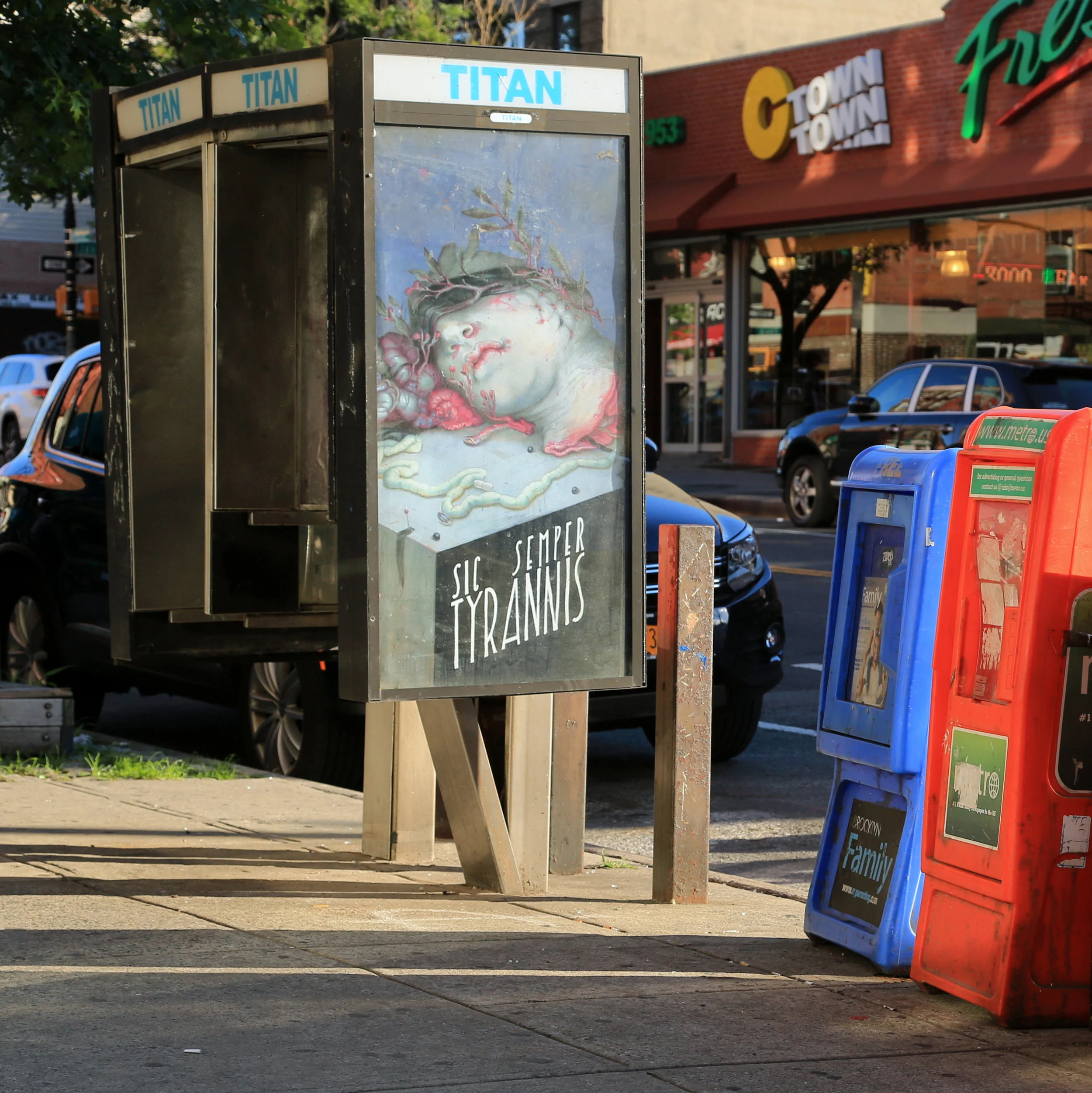
Sic Semper Tyrannis by A. W. Sommers. Photo by Luna Park.

Sic Semper Tyrannis by A. W. Sommers. Photo by Luna Park.

This week, we've got A. W. Sommers. If you know Sommers' work, you may not think of it as super political, but spend a few minutes with her, and it's clear that she's on point. We try to make Art in Ad Places easy for the artists we invite, to give them as little work to do and restrictions as possible. Basically, they should be able to send over a file of work that they've already made, write up a short statement, and sit back and relax until it's time for an Instagram post. Sommers went above and beyond, embracing and getting excited about the unique platform that Art in Ad Places tries to provide, so we are forever grateful to her for that.

Sommers says, "I'm so happy to have the opportunity to participate-- it's thrilling to see work in a new context, outside of expected norms of legitimization (that is, hanging on a white wall, framed, understood as certain object). I like that it's a little confusing. And I feel very strongly about wiggling in weird things to counter, or at least briefly interrupt, the ubiquity of capitalist messaging. Bludgeon folks with something else for a moment."

On a more general note: This week marks the half-way mark of Art in Ad Places. But, we promise, it's not all downhill from here.

Sic Semper Tyrannis by A. W. Sommers. Photo by Luna Park.

Sic Semper Tyrannis by A. W. Sommers. Photo by Luna Park.

A Glitch In The Everyday

Artwork by Lala Abaddon. Photo by Luna Park.

Artwork by Lala Abaddon. Photo by Luna Park.

Lala Abaddon's poster looks a bit like when your computer is about to crash and the screen goes wild, a combination of images literally weaved together to approach abstraction. And over the next few years, computer glitches will become a more common sight on city streets, as more and more printed advertisements are replaced with digital display screens.

Payphones in NYC are in the midst of the transformation from analog to digital. Little by little, they are being replaced by LinkNYC towers, wifi hotspots that for some reason need to be even taller than pay phones (some of which already have wifi hotspots installed). Oh wait, it's quite clear why the hotspots are designed as giant towers: they are covered with large digital advertising displays. Maybe it's just wishful thinking, but we like to think that the computers in those ad displays inevitably have to crash sometimes, and in those moments, maybe they'll finally have something interesting to display.

As for Lala's work, it really is one worth trying to seek out in person, full of little details to get up close to. Lala told us, "The objective I had with this project was to bring some light and happiness to a space that is often ignored, and in some way provide some relief from the monotony of our daily lives." So, get out there and find this wonderful glitch while it lasts. Happy hunting!